Vena: A PCOS focused app
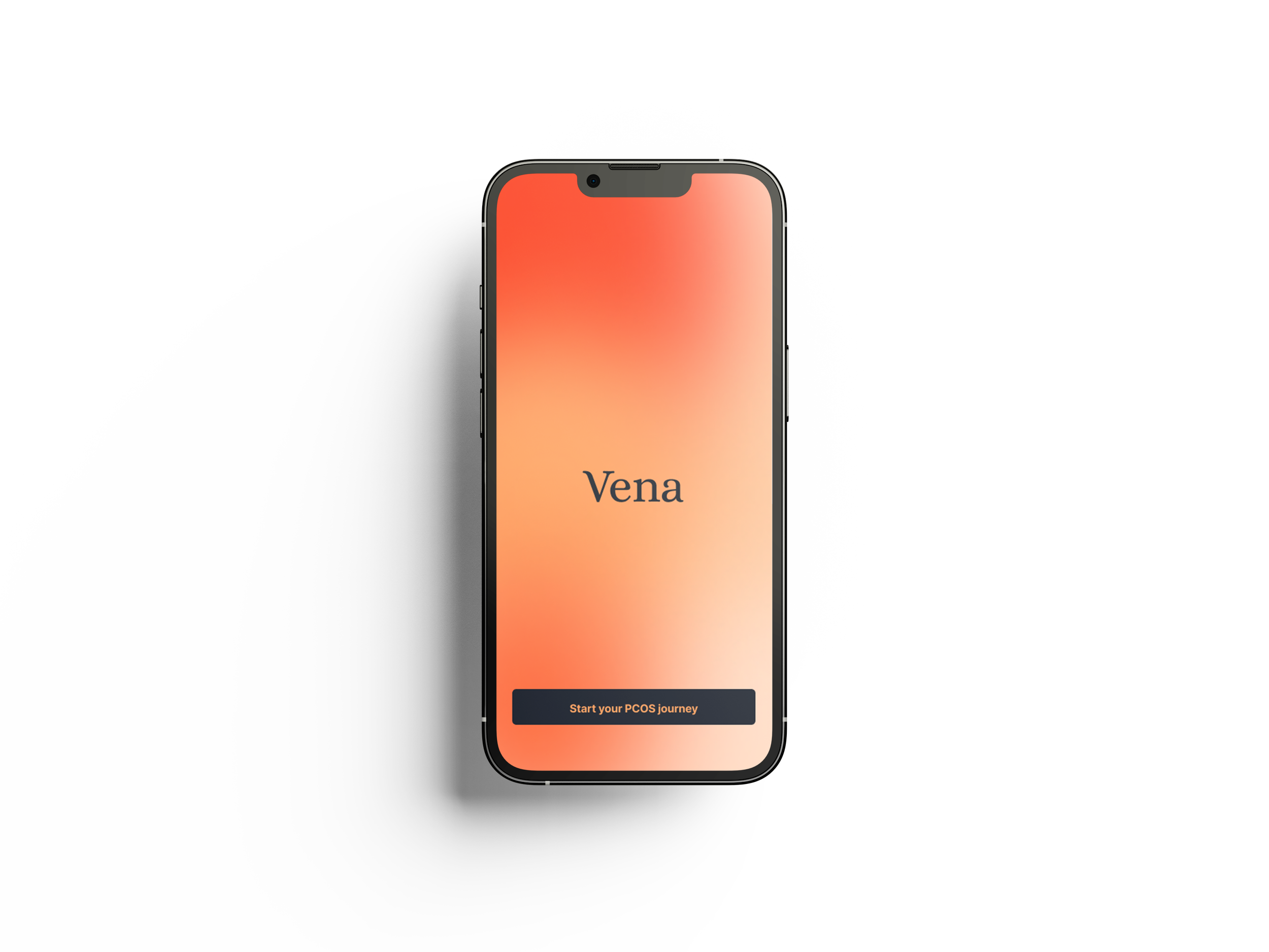
‘Vena’ is an app addresses the user’s key pain points by providing accessible insights into PCOS-specific symptoms rather than focusing solely on period tracking. The system was designed to support users in understanding how lifestyle choices may impact their health, allowing them to make more informed and manageable adjustments to help regulate symptoms and improve day-to-day wellbeing.
Feature 1
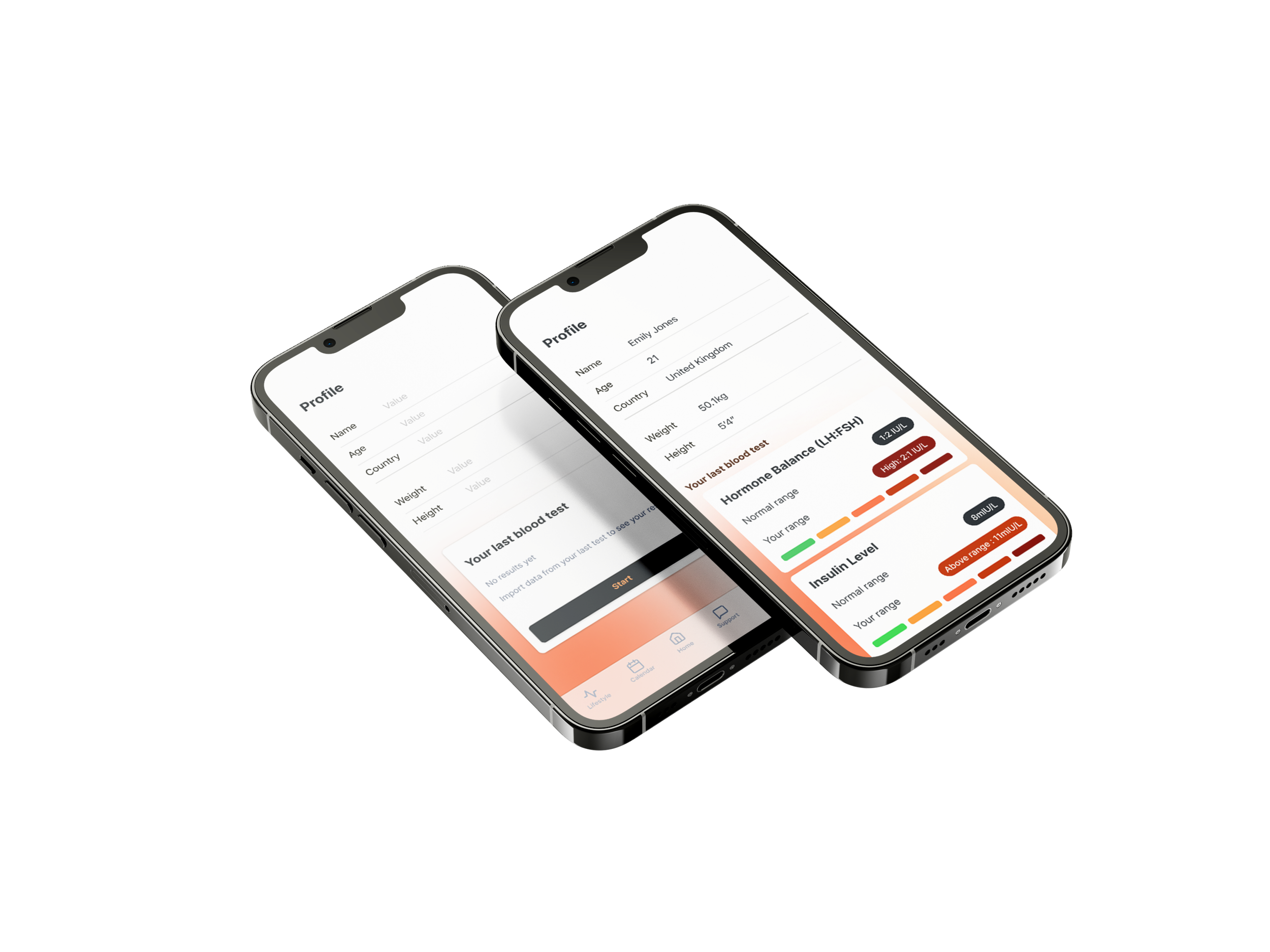
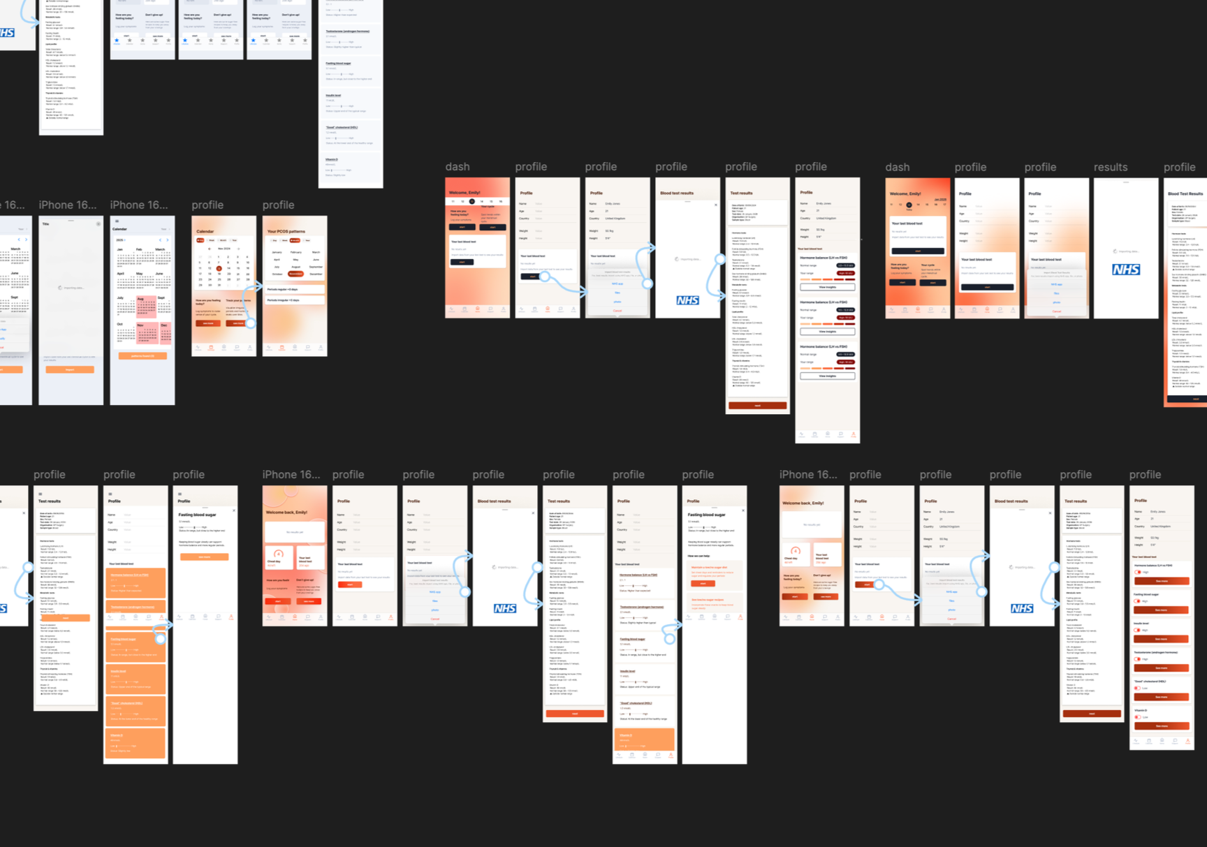
The first feature enables users to upload their blood test results and view them in a simplified, easy-to-understand format. Results are organised by risk level and supported by a colour-coded system, helping users quickly identify areas of concern. Selecting an individual result reveals tailored explanations and lifestyle recommendations, transforming complex medical data into practical, actionable insights. The information is then stored on the dashboard for easy reference and to support conversations with healthcare professionals. A colour-coded scale is used to communicate status clearly, with green representing healthy ranges and red indicating high-risk levels.
When the user selects these individual results, information cards provide tailored explanations and suggest realistic lifestyle changes that may help improve specific PCOS-related symptoms. This creates a more supportive and actionable experience rather than simply displaying medical data.
Once completed, the updated blood test information is shown on the dashboard. Allowing users to refer to efficiently, which can be useful when explaining symptoms to a GP or doctor.
Feature 2
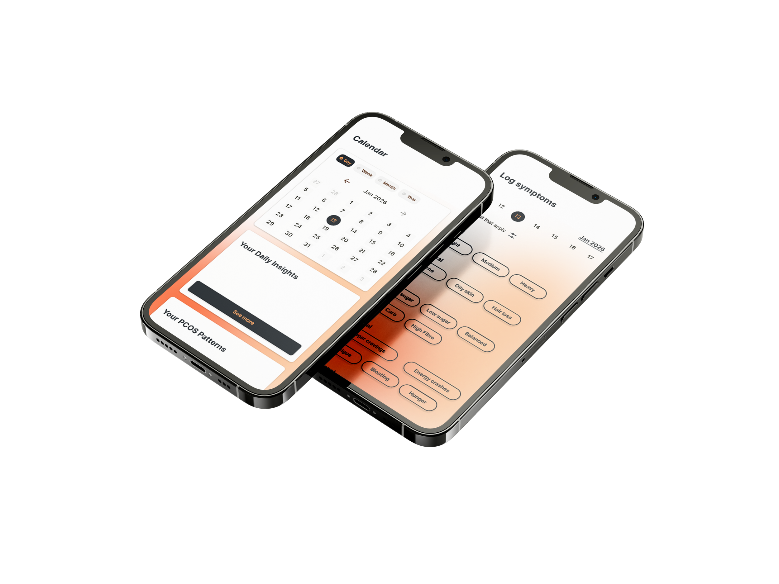
My second feature allows users to track PCOS-related patterns by recording symptoms alongside lifestyle choices such as sleep, diet, stress, and exercise. By comparing these factors over time, users are able to identify relationships between their habits and whether their menstrual cycle appears more regular or irregular. This helps users better understand how lifestyle choices may influence their symptoms and gives them more control over managing their condition.
The feature was designed in response to the user pain point of experiencing unpredictable periods, helping provide reassurance through clearer pattern recognition and feedback. Similar to Feature 1, a colour-coded scale is used to communicate information quickly and intuitively, with green indicating a more regular cycle and red suggesting irregularity. Supporting help cards also provide practical lifestyle suggestions, encouraging users to make realistic adjustments that may positively impact their cycle regulation.
User Testing
The overall response to the app during testing was positive, with users stating they would use the system regularly to better understand blood test results, gain personalised lifestyle guidance, regulate periods, and track PCOS patterns over time. This demonstrated that the app successfully combined clarity, accessibility, and supportive health management within a user-friendly digital experience.
Colour palette
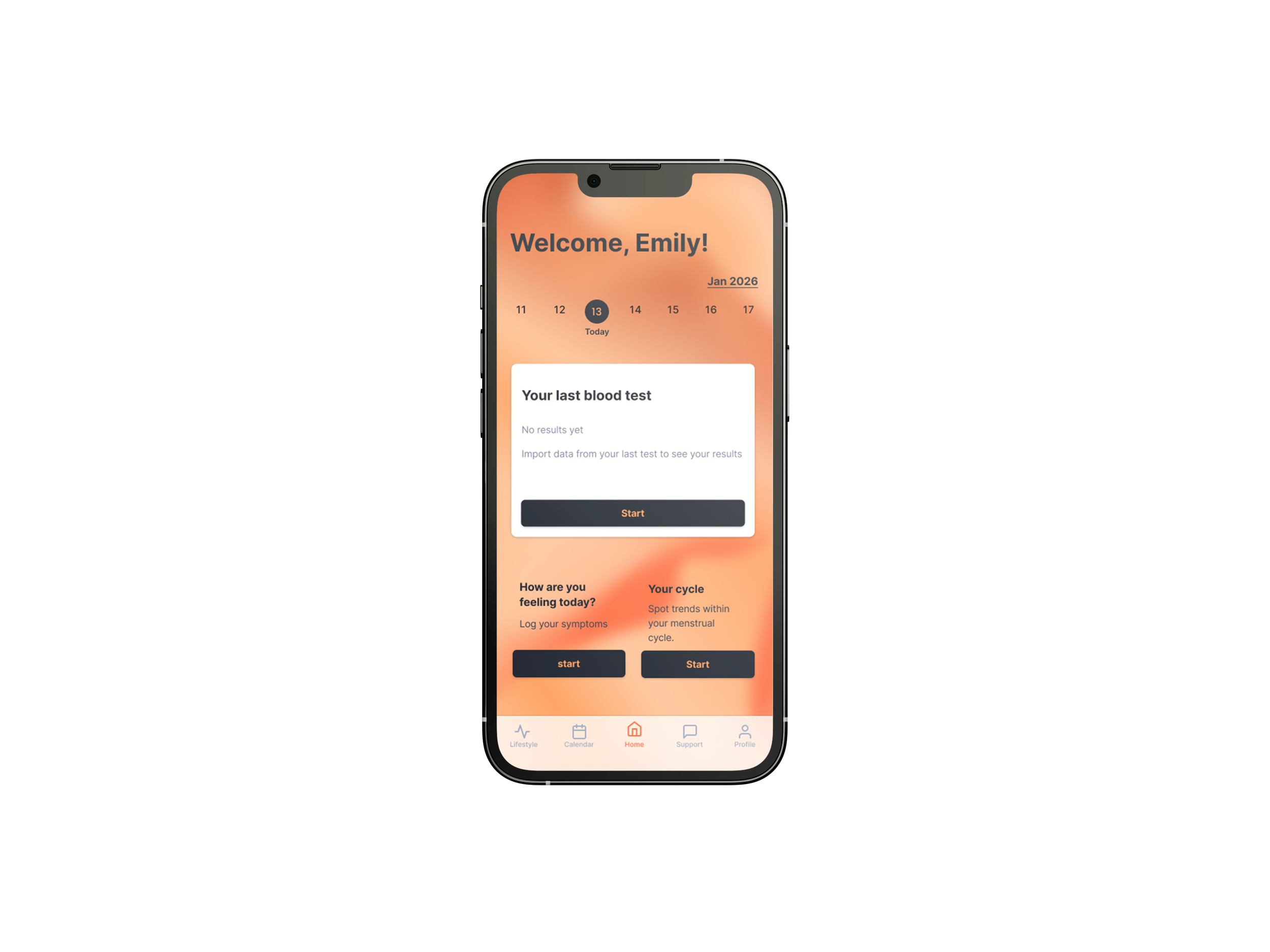
The primary colours used throughout the app are a light orange and dark navy blue. The orange introduces warmth and approachability, helping the interface feel more supportive and less clinical for users managing PCOS. In contrast, the dark navy blue creates strong visual contrast, improving readability and accessibility across the interface.
To ensure maximum legibility and inclusive design, the colour pairings were tested using the APCA contrast checker and met accessibility standards for digital interfaces. As well as research on colour palette principles.