Berkshire Chess Association rebrand
Overview: The Berkshire Chess Association (BCA) comprises ten individual chess clubs across Berkshire, some dating back to the nineteenth century. Through desk research and a field visit to Camberley and Reading Chess Club, several key challenges were identified. The rebrand needed to attract new audiences without alienating existing members, celebrate the association’s heritage without appearing outdated, and maintain a focus on over-the-board chess in an increasingly digital landscape.
Logo design
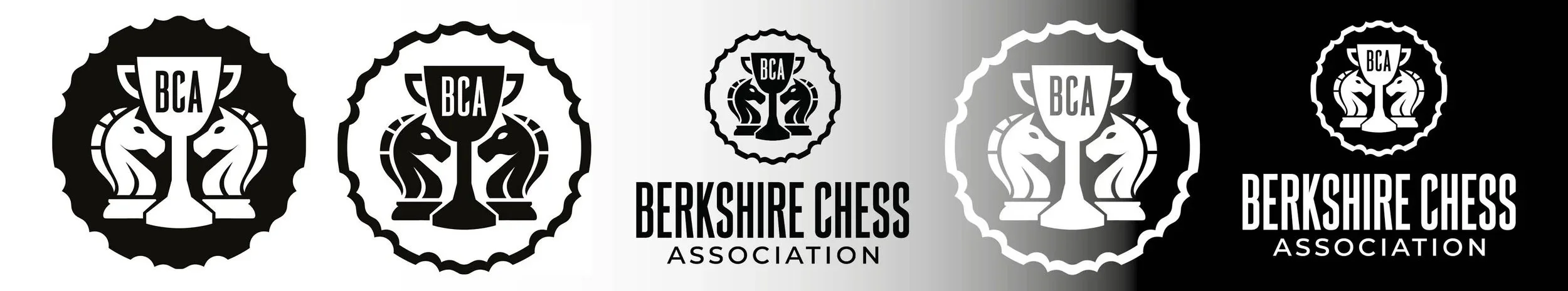
The logo concept draws influence from the Berkshire Chess Associations two league awards, these being a plate and a cup. The plate is seen through the outline of the logo and the cup is seen through the centred trophy. The two knights bring in the chess aspect of the brand, facing each other on either side of the cup.
Typography
The primary typeface, FS Marlborough, is used for “Berkshire Chess” and within the emblem itself. Its condensed display characteristics allow the typography to integrate effectively with the logo while maintaining a strong visual presence. The inclusion of “BCA” within the emblem ensures the mark remains recognisable when used independently.
Montserrat is used for “Association” and supporting communications. As an accessible and widely available typeface, its clean forms and rounded counters contribute to a friendly and approachable brand personality.
Website design
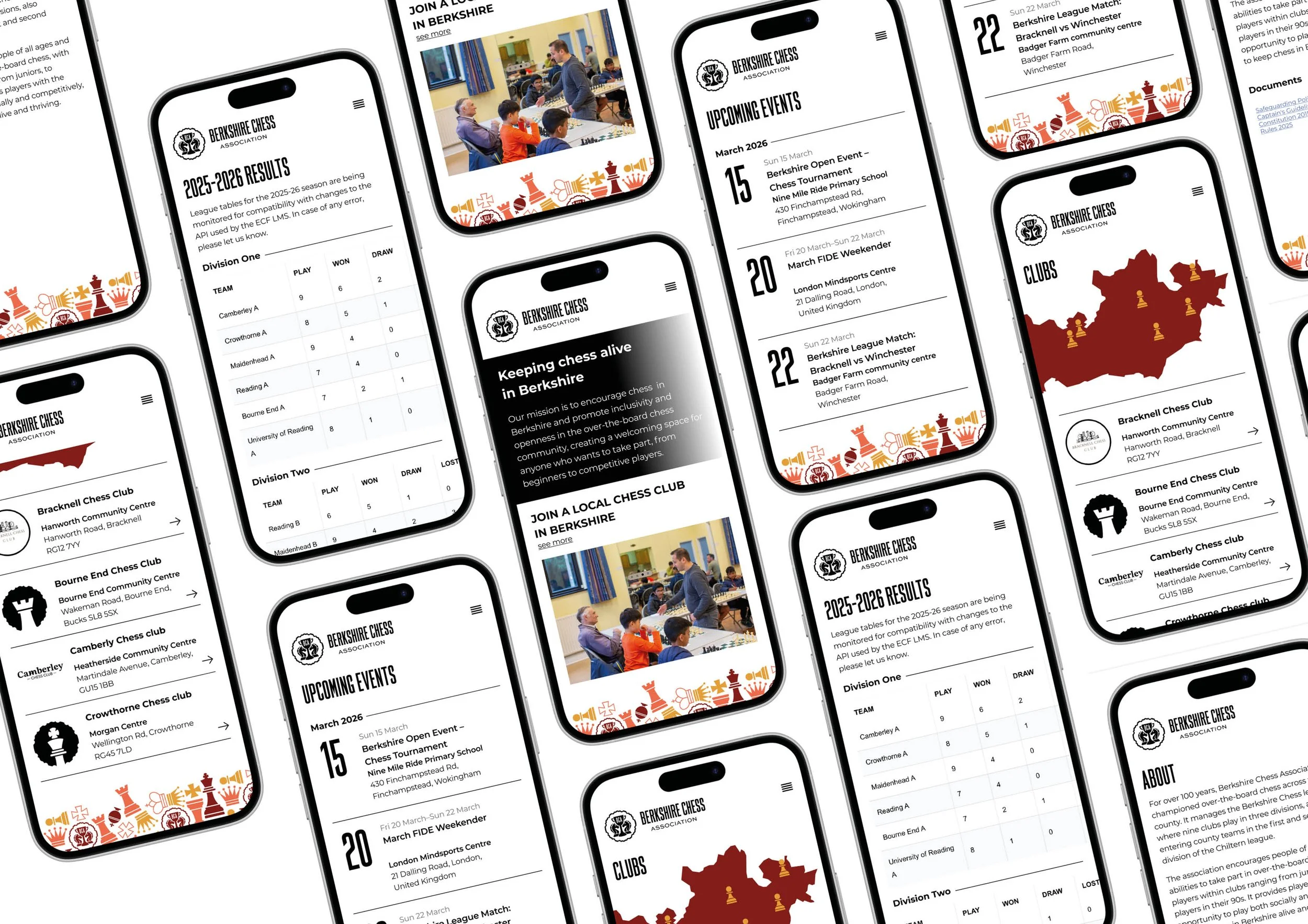
Analysis of the existing website revealed issues with navigation, information hierarchy, and accessibility. League information was disconnected from the main website, requiring users to visit the English Chess Federation League Management System (ECF LMS) separately to access fixtures and results. Information was fragmented across multiple platforms, creating a confusing user experience.
The redesigned website introduces a clear structure, consistent branding, and improved prioritisation of information. The homepage communicates the association’s purpose through a concise mission statement, while dedicated pages provide club information, an interactive map of Berkshire club locations, and a centralised events calendar.
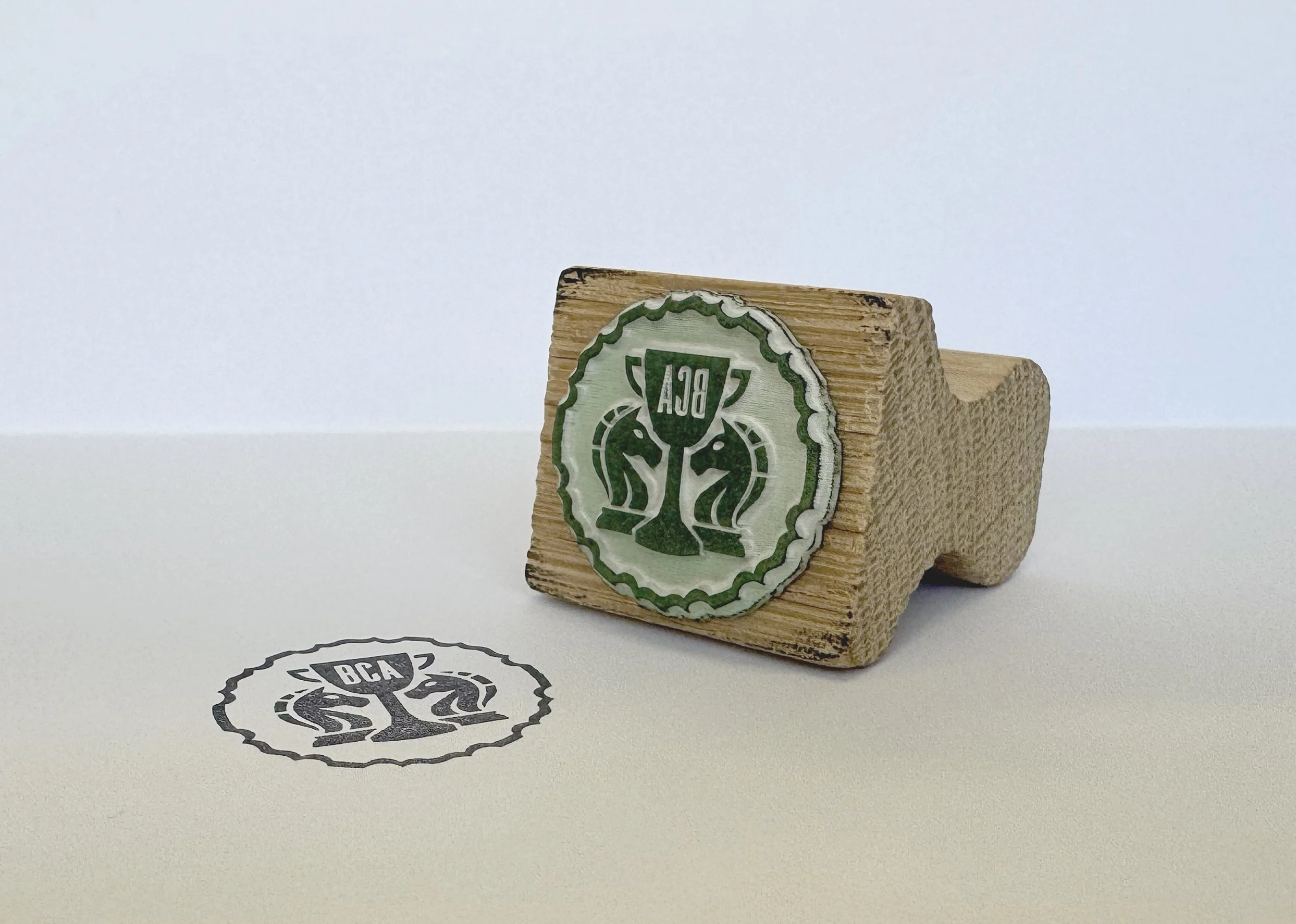
Other creative outputs
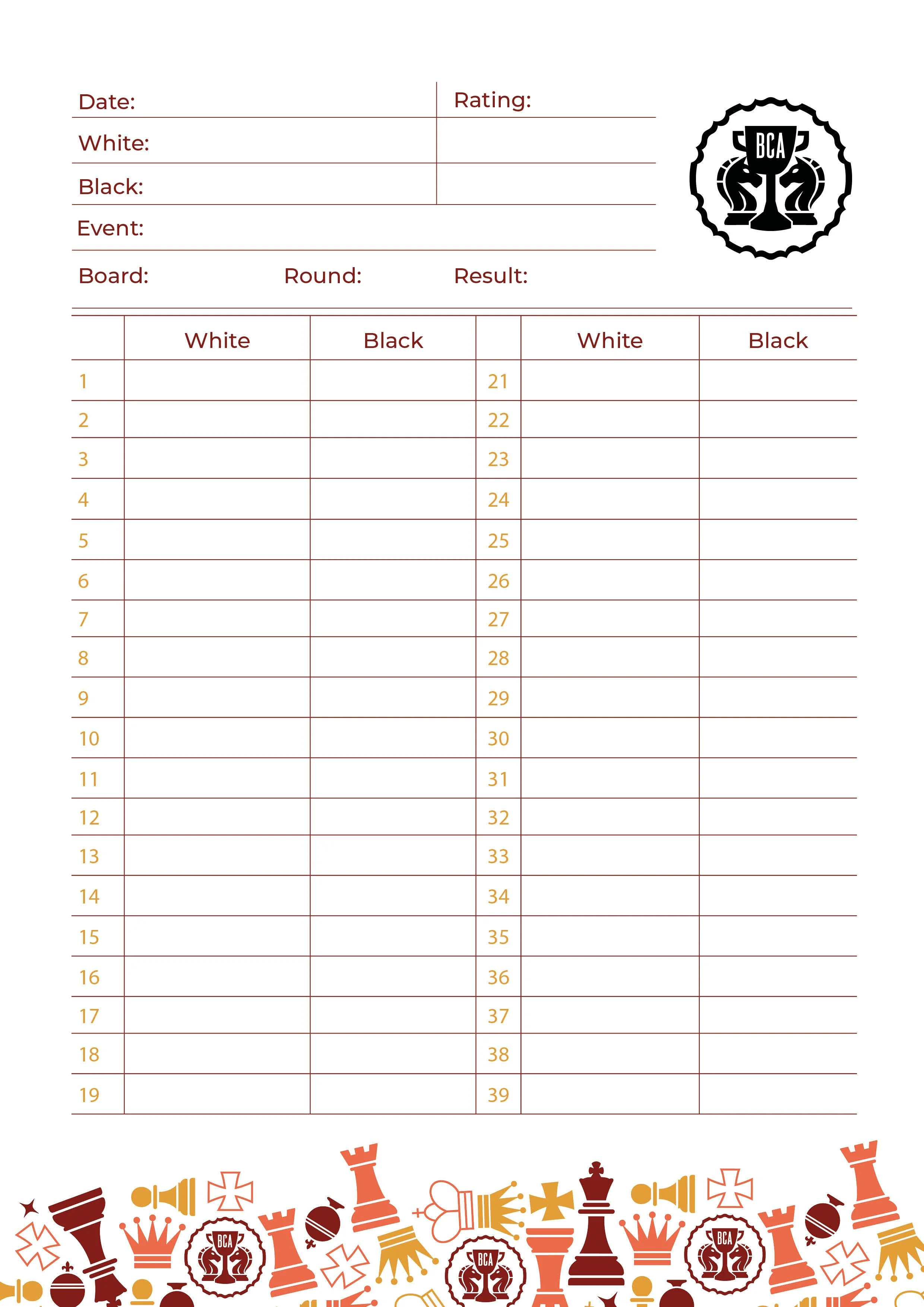
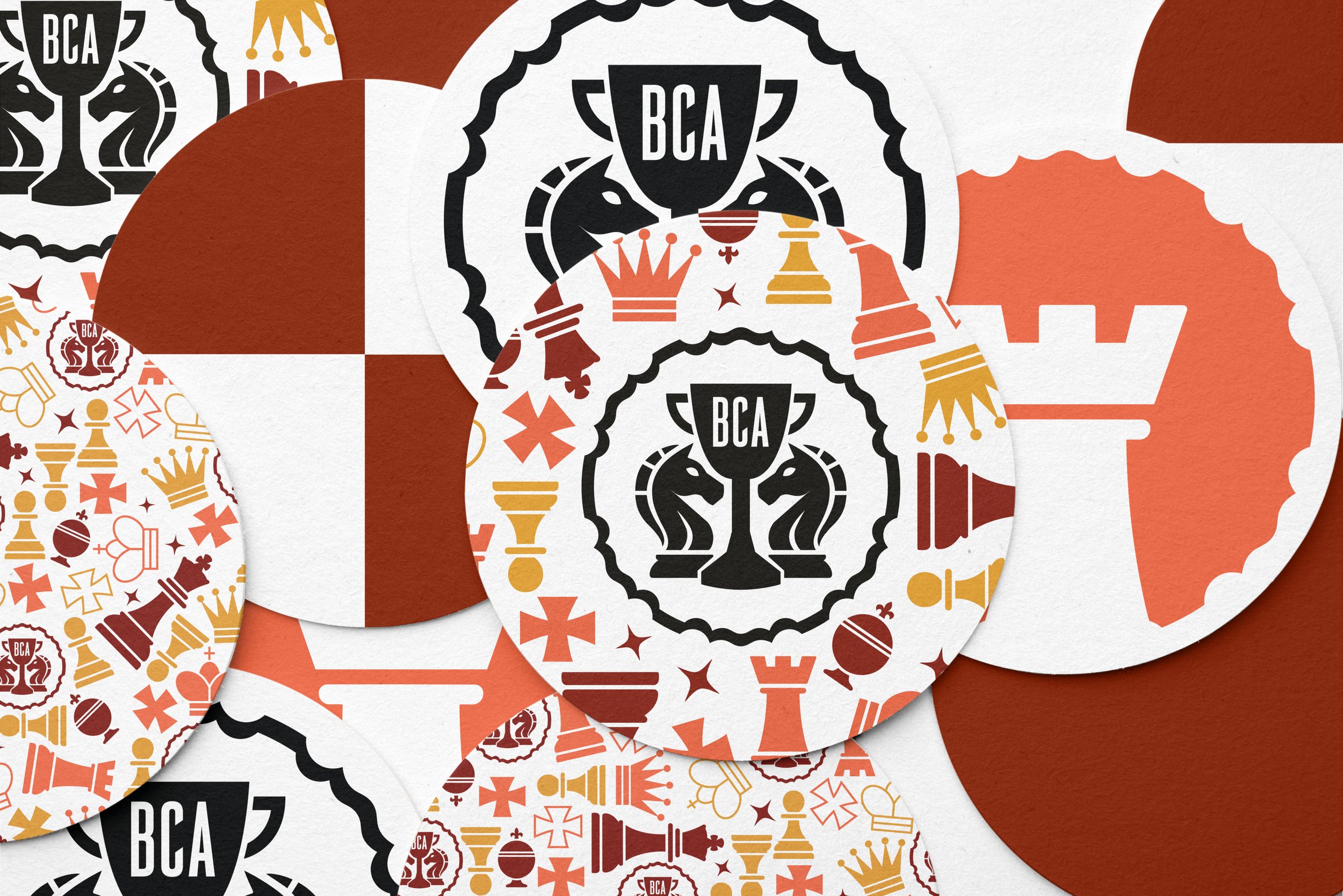
The visual identity was extended across a range of supporting outputs: A redesigned scorecard reflects the new brand while retaining a familiar format used by players during matches. A custom stamp was developed as a playful application of the logo, suitable for printed materials and club communications.
Inspired by the social nature of chess clubs, branded coasters were created to reflect the culture of players who often accompany games with tea or coffee. A short motion graphic animation was also produced using the brand pattern, designed for use across the website and social media platforms. The animation demonstrates the flexibility of the identity system and provides a more engaging and memorable alternative to static content.